New Website, Who Dis?
Website refresh hell
For the last 2 weeks I’ve been in aforementioned ‘refresh hell’, where I’ve thought of almost nothing else - I’ve even been dreaming about image alignment and meta descriptions!
I don’t know about you but if I know can do something myself, I’m begrudged to let anyone else do it for me. With my background in online marketing and SEO, and a husband who’s a very talented graphic designer, I was damned if I was going to let anyone else work on my website refresh but me! To be fair, I didn’t even really let my husband have a look in - he was more on hand for a designer’s-eye-approval once I’d done all the hard work.
The funny thing about websites is, you can go for ages with a website that you think isn’t the prettiest, but is functioning, and it’s only when you spend some real time digging into the bones of it that you discover it’s not really functioning at all and that people searching for your industry or service online are gonna have a hard time finding you. So I pretty much had to start from scratch.
Keep it simple, stupid!
A mantra I always try to remember when it comes to websites, as I’ve encountered so many that are really complicated, full of jargon, and have unclear pages that lead you nowhere. That’s not great for user experience or SEO. So you always have to keep that in mind when making even the simplest of updates to your website.
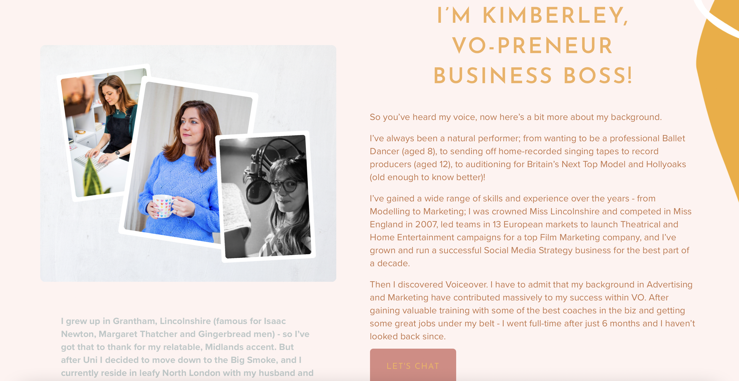
I’d love to know what you think of my new website - have a look around! Hopefully people that land on my website will be able to easily find everything they’re looking for, and prospective clients will be able to find me on search engines more easily too. Here’s to more inbound marketing results in the future!

